Bars: Histograms
This applies to: Visual Data Discovery
Histograms require only one metric (number). The metric data range is divided into intervals and the metric values that fall within each interval are counted. The histogram plots the value counts (Volume) against the metric intervals.
Histograms are supported only by data sources that use connectors that support the calculations necessary for histogram visuals with integer values.
Support for this feature by connector is shown in the following table.
Key:Y - Supported; N - Not Supported; N/A - not applicable
| Connector | Supported? |
|---|---|
| Amazon Redshift | Y |
| Amazon S3 | Y |
| Apache Drill | Y |
| Apache Phoenix | Y |
| Apache Phoenix Query Server (QS) | Y |
| Apache Solr | Y |
| BigQuery | Y |
| Cloudera Impala | Y |
| Cloudera Search | N |
| Couchbase | Y |
| Dremio | Y |
| Elasticsearch 7.0 | Y |
| Elasticsearch 8.0 | Y |
| File Upload | Y |
| HDFS | Y |
| Hive | Y |
| Jira | Y |
| MemSQL | Y |
| Microsoft SQL Server | Y |
| MongoDB | N |
| MySQL | Y |
| Oracle | Y |
| PostgreSQL | Y |
| Python | Y |
| Real Time Sales | Y |
| Salesforce | Y |
| SAP Hana | Y |
| SAP IQ | Y |
| Spark SQL | Y |
| Snowflake | Y |
| Teradata | Y |
| TIBCO DV | Y |
| Trino | Y |
| File Upload (Upload API) | Y |
| Vertica | Y |
Data from Fusion data sources can be used in histograms.
This topic describes:
Configure Settings for a Specific Histogram
To change the settings for a specific histogram:
-
Edit the histogram you want to modify. See Edit Visuals.
-
If you are editing the visual in a dashboard, select Settings from the visual drop-down menu. The sidebar menu for the visual appears.
If you are editing the visual from the Visual Gallery, the sidebar appears to the right of the visual.
-
Select
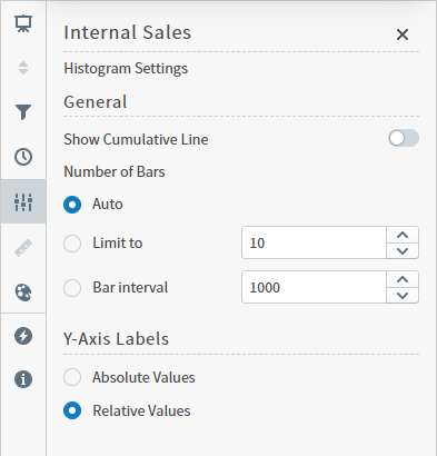
 on the sidebar menu. The Histogram Settings sidebar for the visual appears.
-
Alter the settings as needed:
Setting Description Show Cumulative Line Select to enable the cumulative line to be displayed on your visual.
Number of Bars Specify the number of bars:
- Auto - if you select this option, the bins for all your data set will be built and corresponding bars will be displayed.
- Limit to - specify the maximum number of bars to be displayed on your visual.
- Bar interval - specify the bar interval for your visual.
Y-Axis Labels Select Absolute Values, or Relative Values to use absolute or relative values. -
Optionally, edit the number format for this visual. See Configure Number Formatting for Visuals.
-
Select
 to save the dashboard and the visual with its updated settings.
Configure Colors for a Specific Histogram
To specify the color settings for a specific histogram using the Color sidebar:
-
Edit the visual you want to modify. See Edit Visuals.
-
If you are editing the visual in a dashboard, select Settings from the visual drop-down menu. The sidebar menu for the visual appears. If you are editing the visual from the Visual Gallery, the sidebar appears to the right of the visual.
Select
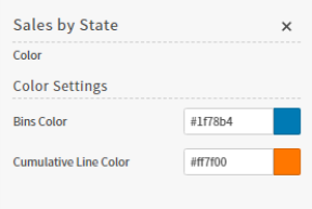
 on the sidebar menu. The Color sidebar for the visual appears.
-
Configure the color settings as described below. Supported color specifications are described in Specify Colors.
Setting Description Bins Color Select the color for the bins on the visual.
Cumulative Line Color Select the color for the cumulative line on your visual. -
Close the Color sidebar and the color settings are dynamically applied to the visual.
-
Select
 to save the dashboard and the visual with its updated settings.