The Visual Interface
This applies to: Visual Data Discovery
Symphony's canvas provides a comprehensive suite of tools to help you conduct in-depth analysis, filter data points, and discover needed insights quickly and efficiently.
Tools in the Visual Interface

-
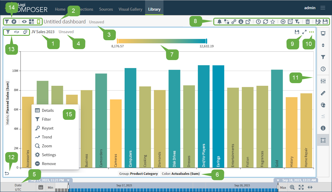
Display Name: By default, a visual's display name is the name of the data source used for the visual for local visuals, or the display name for a visual from the visual gallery. Select the title to edit.
-
Dashboard Name or Title: The dashboard name if editing a visual in a dashboard. Select the name to edit it or save the dashboard to be prompted for a dashboard name. The default name of the dashboard is Untitled dashboard.
-
Indicates whether the dashboard has been saved. This information is not available if you are editing a visual from the Visual Gallery.
-
Indicates whether a visual gallery visual has been saved.
-
If the visual is a local visual, this area is blank. All local visuals are saved when you save the dashboard.
-
-
Time Bar and Time Controls:
-
Filter your data by a time attribute.
-
Zoom into specific period within the selected date range.
-
Explore the dynamics of your data using the Play/Pause button.
See Use the Time Bar.
-
-
X- and Y- Axis Labels and the Color Metric (availability varies, depending on the visual style): Select an axis label to change an attribute or metric. See Change the Axes and Change the Visual Color Metric.
If you disable the Volume property in a data source configuration, it does not appear in visual tooltips. The only exception to this is in histograms which plot the volume or number of records.
-
Legend: By default, a legend is available for supported visual styles, and can be switched on or off in the Colors sidebar menu.
-
The dashboard icon bar. Use the options here to manage the dashboard. See Use the Dashboard Icon Bars. This is only available on a dashboard; not on a visual edited from the Visual Gallery.
-
Select
 to expand a visual on a dashboard. This allows you to get a closer look at it. This is only available on a dashboard; not on a visual edited from the Visual Gallery.
 -
The
 at the top right of a visual displays the visual drop-down menu. This menu includes an option to open Settings for the visual, and its sidebar menu.
 -
The visual sidebar menu. Select a sidebar menu option to open an appropriate sidebar for a visual. See Use the Visual Sidebar Menu.
-
Select
 to undo the most recent change you made to a visual.
 -
Visual-specific options:
- Select
 to filter the data on a visual.
 - Select
 to view published filters.
 - The visual icon indicates if a visual is local (
 ) or a visual gallery visual (
 ).
).
- Select
-
Dashboard-specific options:
- Select
 to filter the data on a dashboard. The dashboard-level filter icon is available only when all visuals on a dashboard are from the same data source.
 - Select
 to open dashboard and visual interactivity settings.
 - Select
 to toggle dashboard view mode between Viewer and Editor modes.
 - Select
 to enable and disable locking the dashboard layout.
 - Select
 to enable and disable responsive layout for this dashboard. See Using the Responsive Dashboard Layout.
- Select
-
The context menu. Use menu options to view or adjust data. See Use the Context Menu.