Change the Axes
This applies to: Visual Data Discovery
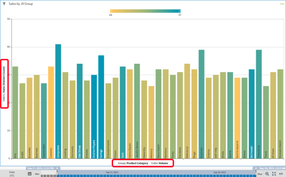
Many visual styles show data on a standard coordinate grid, with axes labels identifying the values depicted horizontally and vertically on the visual. Examples include bar charts, line charts, and scatter charts.
Use the axes labels on these visuals to change the metric (y-axis) and attribute (x-axis) fields graphed in the visual. The number of labels displayed on a visual depend on the number of metrics and attributes on which the visual is based.

You can specify the default labels for visuals on the Fields tab of your data source configurations. Controls for these options are provided using the interactivity sidebar. See Control How Users Interact With a Visual.
See the following topics:
You can also change the metric used to determine the colors on the visual. See Change the Visual Color Metric.
Change a Group Attribute
You can change the x-axis field, or group attribute, on a visual that plots data on a coordinated grid.
To change the visual group (x-axis) attribute:
-
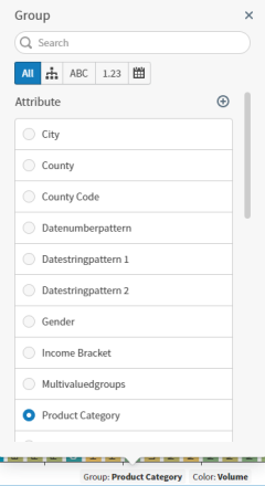
Select the group attribute (x-axis) label on your visual. A Group dialog appears.

-
Select a new field to be viewed on the x-axis of your visual.
The visual renders the newly selected attribute.
Change a Metric Field
You can change the y-axis field, or metric, on a visual that plots data on a coordinated grid.
To change the visual metric (y-axis field):
-
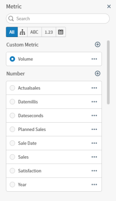
Select the metric (y-axis) label on your visual. A Metric dialog appears.

-
Select a new metric to use as the y-axis of your visual and a metric function to use to aggregate the data on the visual. See Metric Aggregation Functions.
The visual is updated and renders the newly selected metric. If you need to perform more complex analysis of your data set, you can add custom metrics .