Styles
This applies to: Managed Dashboards, Managed Reports
A style contains the settings for most of the properties of a component, filter, or data visualization. The only exclusions are properties that are typically never shared, such as references to a specific a metric set, or the specific text displayed in a label or button.
You can save your own style and then easily apply it to another of the same type of element, or you can apply one of Symphony's provided styles.
Data Visualization Compatibility
As with components and filters, you can usually only apply a style to the same type of visualization that was used to save the style.
There are certain exceptions where you can apply the same style to different visualization types:
-
A single chart can contain different chart types on each data point series, so any chart style can be applied to any other chart, but series properties from the style are only applied to series with a similar chart type setting. For example, a style created from a chart with line series can be applied to a bar chart, but the styling of a line series will not be applied to the bar series because these two chart types are very different.
-
Styles for all of the relationship diagram types are compatible with each other because they are each made up of nodes and links that have similar settings.
Sparkline, Data Bar, and Horizontal Plot are specialized versions of charts in reports and scorecards, which are not compatible with regular charts so that a theme can contain separate styles for line charts (with visible axes) and for sparklines (without visible axes), for example.
Each type of gauge uses separate styles (e.g., radial vs. linear gauges), but a single gauge can have multiple pointers with different pointer types, so pointer properties are only applied to matching pointers. If none of a gauge's pointer types match those saved in a style, only the rest of the style's properties will be applied.
 Apply styles before customizing the visualization. Applying a style may remove existing settings, such as a color rule.
Save a New Style
Create a new blank dashboard, and click Components and then Button in the toolbar to add a button component. The following steps are also similar when saving a style for a filter or visualization, including the visualization in a full screen metric set.
-
Use the Properties window to change some settings for the button. For example, switch to the Look tab and customize some of the 'rest' properties.

-
On the toolbar, click Styles, and then click Save Style.
-
In the Save dialog, select a folder location and enter a file name for the style. You may want to include the type of the element in the name for easy reference, for example, Button Style Green.
-
Click the submit button at the bottom to save the style.
To see the saved style, go to the Explore window and expand the Styles folder. Your style may not appear because it was just created, in which case you can right-click on the folder and choose Refresh.
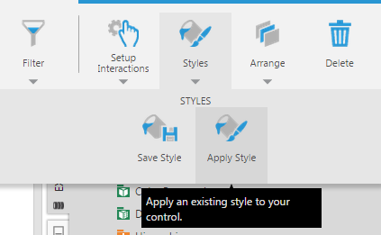
Apply an Existing Style
Create a new blank dashboard, or open an existing dashboard to add a new button to the dashboard.
There are a couple of ways to apply a saved style to an element such as this button, as well as any other type of element or to a visualization in a full screen metric set.
-
You can go to the Explore window and expand the Styles folder, then drag a style onto the element. We now have two similarly-styled components.

-
With your element selected on the canvas (or when editing a visualization full screen), another way to apply a style is to click Styles in the toolbar and Apply Style.
In the Open dialog, select the saved style that you want to apply, and then click the submit button at the bottom.
When applying a style, you can expand the Shared subfolder under Styles to find various styles provided for you by Symphony. Choose one named with an element type that matches your element (e.g., Button).