Visualizations for Symphony Metric Sets
This applies to: Managed Dashboards, Managed Reports
A metric set's data is always shown in a visualization that you can change and customize. When you edit a metric set full screen, this visualization is the default visualization used when the metric set is first added to a dashboard or other view, but you can also use it just for your own analysis.
![]() The metric set defines all of the data that's displayed and its settings, such as initial filtering and sorting. Each visualization is separate so it can be changed and customized when reusing a metric set.
The metric set defines all of the data that's displayed and its settings, such as initial filtering and sorting. Each visualization is separate so it can be changed and customized when reusing a metric set.
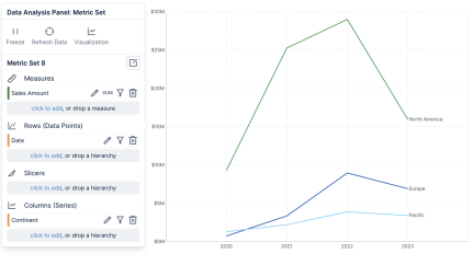
If you didn't choose a particular visualization yet or customize it, Symphony will automatically change the visualization when you first add data based on its recommendations. For example, a measure and a time dimension hierarchy will be automatically visualized as a line chart, which is best for seeing the trending of a measure over time.

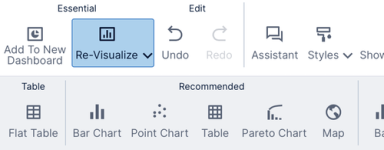
At any time, you can change to the visualization of your choice by clicking Re-Visualize in the toolbar and choosing an option. Once you have chosen a visualization yourself, customized it, or saved and re-opened this metric set, it will not be changed automatically.

You can customize a particular visualization in a number of ways:
-
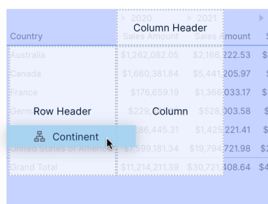
Drop zones may appear over your visualization when dragging data from the Explore window, allowing you to choose how it will be visualized. For example, you can decide whether to display a hierarchy as a regular column, a row header column, or as a row of column headers in a table.

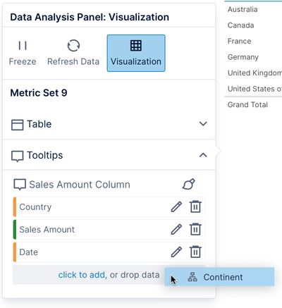
- Similarly, you can click the Visualization button in the Data Analysis Panel of any visualization and drag data from the Explore window or click to add data directly under a visualization option, such as Tooltip for displaying additional details in a popup when hovered or long-tapped.

See Setting up the visualization and Visualization tab examples for more details and examples. - Common visualization options can be found in the toolbar under Contextual section, and in the right-click context menu, such as changing a vertical bar (column) chart to a horizontal bar chart.

- The full set of visualization settings are found in the Properties window.
When a metric set is added to a dashboard or another view, the default visualization from the full screen editor is used as the template for a new visualization. The metric set is reusable and each visualization is separate, so you and other people you share the metric set with can customize it and visualize it differently.
![]() If you want to reuse a visualization in multiple places and be able to make changes to all of them at once, you can create a dashboard for that visualization and drag it onto other dashboards and views.
If you want to reuse a visualization in multiple places and be able to make changes to all of them at once, you can create a dashboard for that visualization and drag it onto other dashboards and views.