Use The Filter Snippet Sidebar Menu
This applies to: Visual Data Discovery
Use the filter snippet sidebar menu to:
- Define data settings for the filter snippet
- Define filter snippet settings
- Adjust widget settings for the filter snippet
To access the filter snippet sidebar menu, select ![]() Settings from the menu (
Settings from the menu (![]() ). The filter snippet sidebar opens.
). The filter snippet sidebar opens.
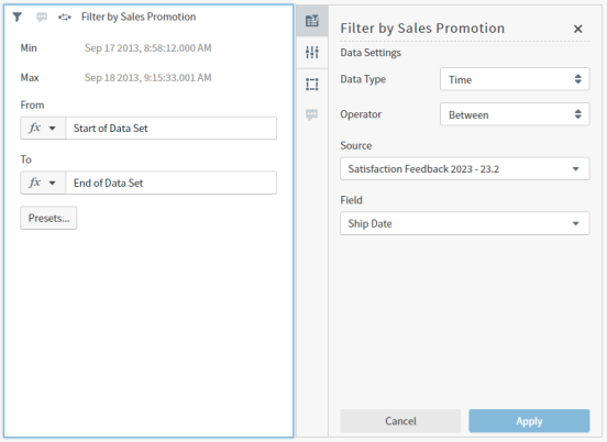
If this is a new filter snippet, default settings are shown. If this is an existing filter snippet, current settings are shown.
![]() If you are editing a filter snippet that references unavailable sources or fields, an Unavailable message is shown in the affected drop down. Select a new source or fields as needed.
If you are editing a filter snippet that references unavailable sources or fields, an Unavailable message is shown in the affected drop down. Select a new source or fields as needed.
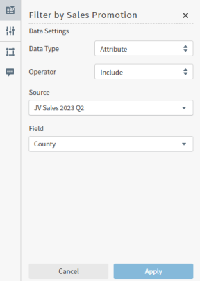
Data Settings Tab
Adjust the data settings for this filter snippet, then select Apply as needed to apply your changes to the filter snippet.
| Setting | Description |
|---|---|
| Data Type | Select a data type to filter: Attribute, Time, or Number. If you select Time, you can set conditions for the time spans Between or Not Between in the widget itself. |
| Operator | Select an operator to use: Include or Exclude for Attribute and Number data types depending on whether you want to include or exclude the value from the data. Select Between or Not Between for Time data types, then define the conditions for time spans in the widget itself. |
| Source | Select an available source to use. After you select a source, you can select an available field from that source. |
| Field | Select an available field to use in this filter snippet. |
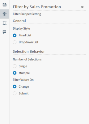
Filter Snippet Settings Tab
Adjust the filter snippet settings in this work area. Save the dashboard to save your changes.
| Setting | Description |
|---|---|
| Display Style |
Select Fixed List to display all available selection items in a selection list.
Select Dropdown List to display all available selection items in adrop-downlist.
|
| Number of Selections |
Specify whether only one or multiple data values can be selected in the filter snippet. Select Single to allow users to select only one data value; select Multiple to allow users to select more than one value.
|
| "No Selection" Label |
Visible when the Single option for Number of Selections is selected. Enter text to display when no values have been selected. Default text is None. |
| Placeholder Text |
Visible when both the Dropdown List and Multiple options are selected. Enter text to display in the Search field when no values have been selected. Default text is Search. |
| Filter Values On |
Visible when the Multiple option for Number of Selections is selected.
|
| Submit Button Text |
Visible when the Submit option for Filter Values On is selected. Enter text to display for users to apply the filter snippet to connected visuals. Default text is Submit. |
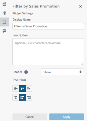
Widget Settings Tab
Adjust the widget settings for this filter snippet, then select Apply as needed to apply your changes to the filter snippet. Save the dashboard to save your changes.
| Setting | Description |
|---|---|
| Display Name | The display name for this filter snippet. Change here or edit directly in the widget. |
| Description | An optional description for this filter snippet. Blank by default. Maximum 750 characters. |
| Header |
Adjust the header behavior. The default setting is
|
| Position | Adjust the position of the widget content in the cell (widget footprint in the dashboard) to align vertically and horizontally as appropriate within the space. Select center, top, or bottom as needed. |